chapter-04-s03
Formatting labels and Events
Starting with the previous code, the calculator with buttons, we will add in this chapter more information regarding labels. A label is a component which shows information to the user. It can be used both for showing fixed and information that can change. The first case, fixed information, was already presented at the beginning of this course, now we are going to focus on the second one. When the user pushes the buttons of the calculator it has to get feedback about what has been done. The buttons change aspect in an automatic way but they have no information about the operations performed. This problem will be fixed using a label which shows the values of the operation.
Besides showing the text in the label, it is necessary to save the numbers and the operation somewhere. A couple of auxiliary variables will be used for that purpose. The flow of the app would be:
- User introduces the first number
- Mathematical operation is selected
- User introduces the second number
- The ANS button is pushed.
The easiest way would be concatenating text on the button and the label to show the operation to the user. The problem with this approach is it would make necessary to extract that information of the label later to do the operations by code. Unfortunately, this solution has more cons than pros. A different approach comes following the opposite way: the buttons update some variables and, then, update the labels. In this way, the label would show only the internal status (model) and it would be easier to handle. The use of methods (functions) will be also introduced to implement this feature.
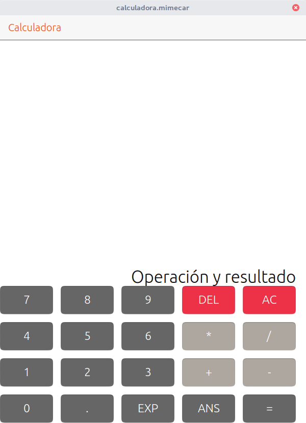
Let’s start taking as initial point the calculator app from previous chapter as shown in the next figure.

Label to show operations
In a first iteration the label will be fixed in the upper part of the grid of buttons. The gap at the top will be used later to show a history of the operations with another component to work with text. The first step will be, therefore, to create the component with a text field by default. The point is, how do we start? Based on the comments related to the previous exercise of the grid done by the participants, there are still some doubts about how the anchor works. From this moment, anchors will be used quite frequently, so it is important to remember its functioning to continue this chapter.
The components in QML need to be seen as boxes. Each box has four anchors in the up, down, left, right positions. Playing with those anchors is possible to distribute the components on the screen in an arbitrary way. There are two ways for the distribution of the components:
- By defining relationships between them using anchors.
- By using a layout.
In the calculator the two previous ways have been already applied during this course. The buttons are distributed using a layout grid. The grid has the same behaviour than a component in QML, which makes it, in terms of design, a box with four anchors. The components are placed inside a Page which is at the same time, a box with anchors.
To move the grid of buttons, the anchors of the page and the anchors of the grid need to be related. Depending on this relationship, the organization will change in the screen. The easiest way is to link the position of the grid bottom to the same position in the page:
anchors.bottom: page.bottom
One of the common doubts arriving at this point of the course is: where is "page" defined? The component in the code is Page and QML is case sensitive. When a component is created, several attributes must be defined. Among those attributes, there is an identifier which allows to access the component from other parts of the code. This id is not mandatory to show the component, but it is mandatory when you want to use the component later. The Page definition would be:
Page {
  id:page
  ...
}
Now, any component could access the information in Page. The identifier ("id") can be both used in the components and in the layouts. If an id is added to the grid, it will be possible to anchor the label to the component. In this new way, if the grid grows when adding new components, the label will adapt to the new position without additional changes.
Let’s create the label and assign an ID:
Label {
  anchors.bottom: grid.top
  text: "Operation and result"
}

Grid {
  id: grid
  ...
}

The label is placed in the upper part of the grid but the text remains a little bit weird in the left part of the screen. Following the comparison with the box, the label is a box which starts in the first "O" and it ends in the last "o". To align it to the right, it is necessary to add a new anchor, which must be the same for label and grid
anchors.right: grid.right

An important detail, which cannot be appreciated in the figure due to the background, is that neither grid nor label are aligned with the right part of the screen. There is still an empty part with no use. It is possible to assign the label to the anchor of the page instead of using the corresponding one of the grid, but in that case buttons and labels would be misplaced. A solution to this problem will be shown later in this course.
Before continuing with the app it is necessary to fix a little bit the appearance of the label. The text must be bigger and the font will be changed for a smaller monospace type of font, that means, all characters equally spaced. Both modifications will be applied to the Label, which has been created previously.
The same logic applied in the buttons, using the attribute font.pointsize, will be follow to change of the fontsize. The final result should be close to:
In this example the fontsize is 25 px. You can find an example of a similar code in the buttons and it will be great for you to struggle a little bit with this part of the app. The doubts of the previous part appeared just in the parts of the code which were not specifically in the explanation. It would be very easy for me to solve your doubts, but it is important for you to look for your own solution when facing problems.
The attribute font.family can be used to change font family. The following code has to be added inside of the label:
font.family:"UbuntuMono"
Just with text characters is more complicated to distinguish the effect of the monospace font. That is the reason why I have replaced the initial text by numbers and operators.
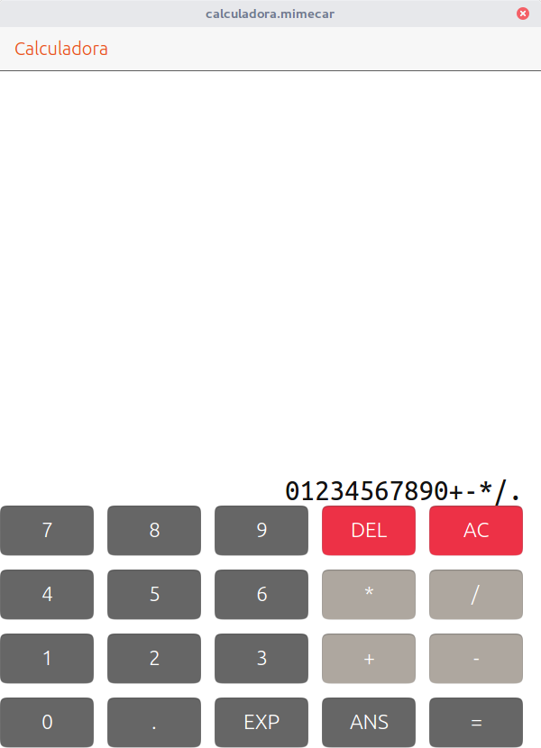
The same code but with the font by default. There is no difference in the numbers when changing font type but you can see some major changes in the operator symbols. Notice specially the change in position in the zero respect the "AC" button in both figures.

Adding logic to the buttons
The objective is making the buttons pressed by the user appear as text of the label. If the user presses number 7, the number 7 will appear as text. When the user presses another button, the text present in the label will be concatenated with the text of the new button.
When components are used in QML, several signals are generated automatically. For example, button pressed or button released. Those events can be processed in the code and do other actions when detected. As an example of this behaviour, the signal onClicked will be processed. The code of button "7" will be set as follows:
Button {
  text: "7"

  font.pointSize: 17
  color: UbuntuColors.graphite

  width: buttonWidth
  height: buttonHeight

  onClicked: {
    result.text = result.text + "7"
  }

}
To access the label, it is necessary to create first an identifier (id) with the name "result". When pressing the button, an onClick signal is generated. As that signal is the one being captured, the code in curly brackets is being executed. Basically, it makes the attribute text to concatenate the value it had with the new value of the number.
As the final exercise of this chapter, I will ask you to add the logic to all the buttons of the calculator in the same way. The buttons of the operations can show in the label the same text as the one on the button. At the end, the app needs to show in the label the buttons pressed.
This part is a little bit shorter than the previous ones. Besides learning how the QML components work, I am introducing logic to the app. This logic allows the app to perform certain actions when users work with it. In the course, I start from scratch considering the knowledge of the user in programming QML and general programming. That is the reason why I am introducing concepts step by step to make it easy to follow.
If you have any question, please contact me using the contact details associated with the course and I will be pleased to answer all your questions.
People who have collaborated
- Santiago Mohr: English translation.